How much of your income comes from high-value donors versus mid-value and standard-value? This question is important because
- Standard value and mid-value donors have substantial costs due to their numbers, but high-value donors generally require more individual resourcing through relationship management.
- High-value donors are few in number but make up a more significant proportion of income, so their recruitment or loss have greater impacts on overall revenue.
Since different charities will have different definitions for high-value donors, we can instead think of the question in terms of proportions. For example, we can look at how much income does the highest 20% of donors donate as a proportion of total income, with the traditional wisdom is that this is governed by the Pareto Principle, or 80-20 rule, and that this group of donors should contribute around 80% of the income. But how true is this? Furthermore, what proportion do the top 1% make, and the top 50%?
To get a complete picture, we can borrow the Lorenz curve from economics, which is usually used to visualise inequality in income. By ranking our donors from lowest to highest donation, we can calculate the cumulative sum of income as we add each donor. This produces a curve that describes the relationship between the number of donors and the proportion of income.
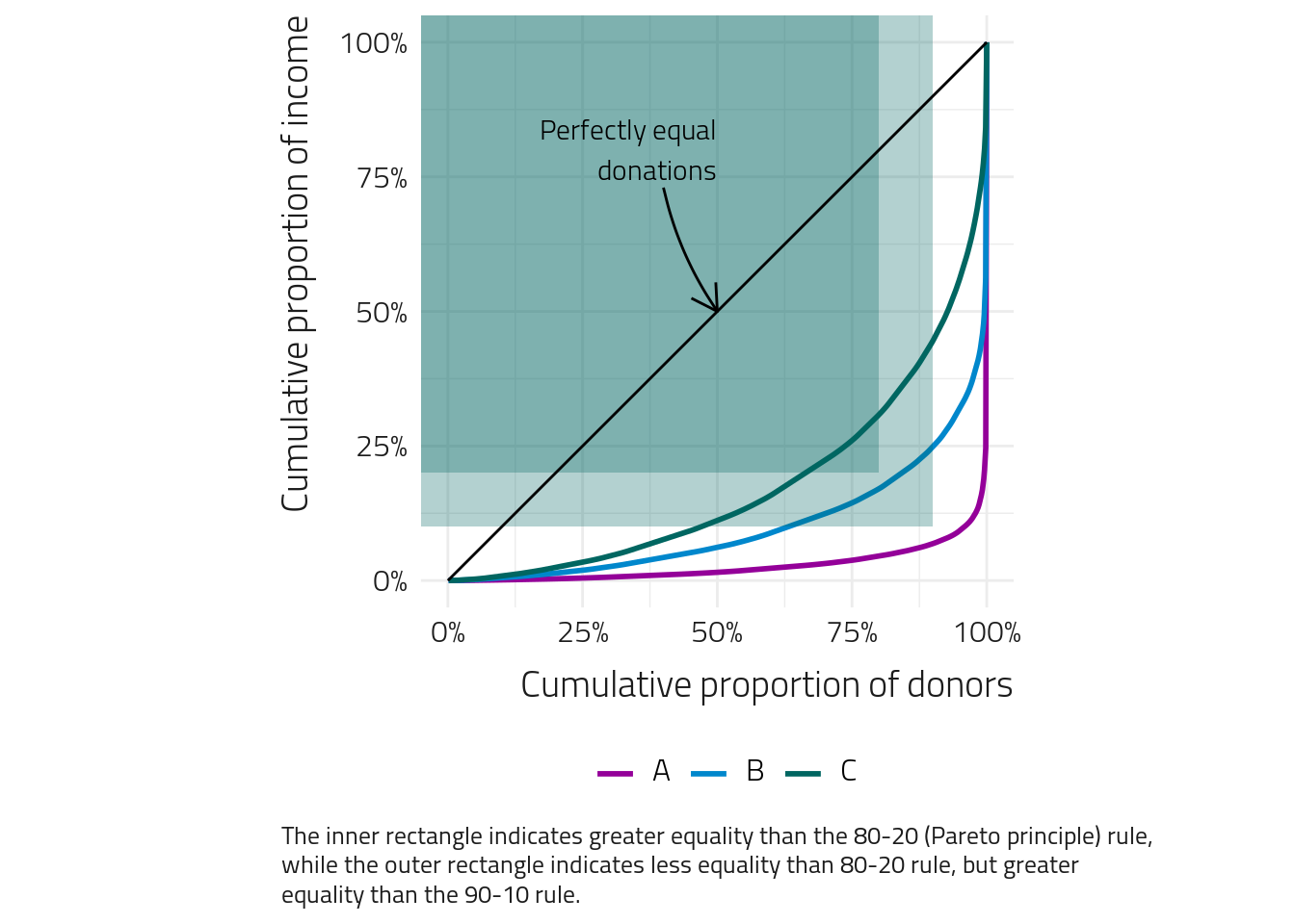
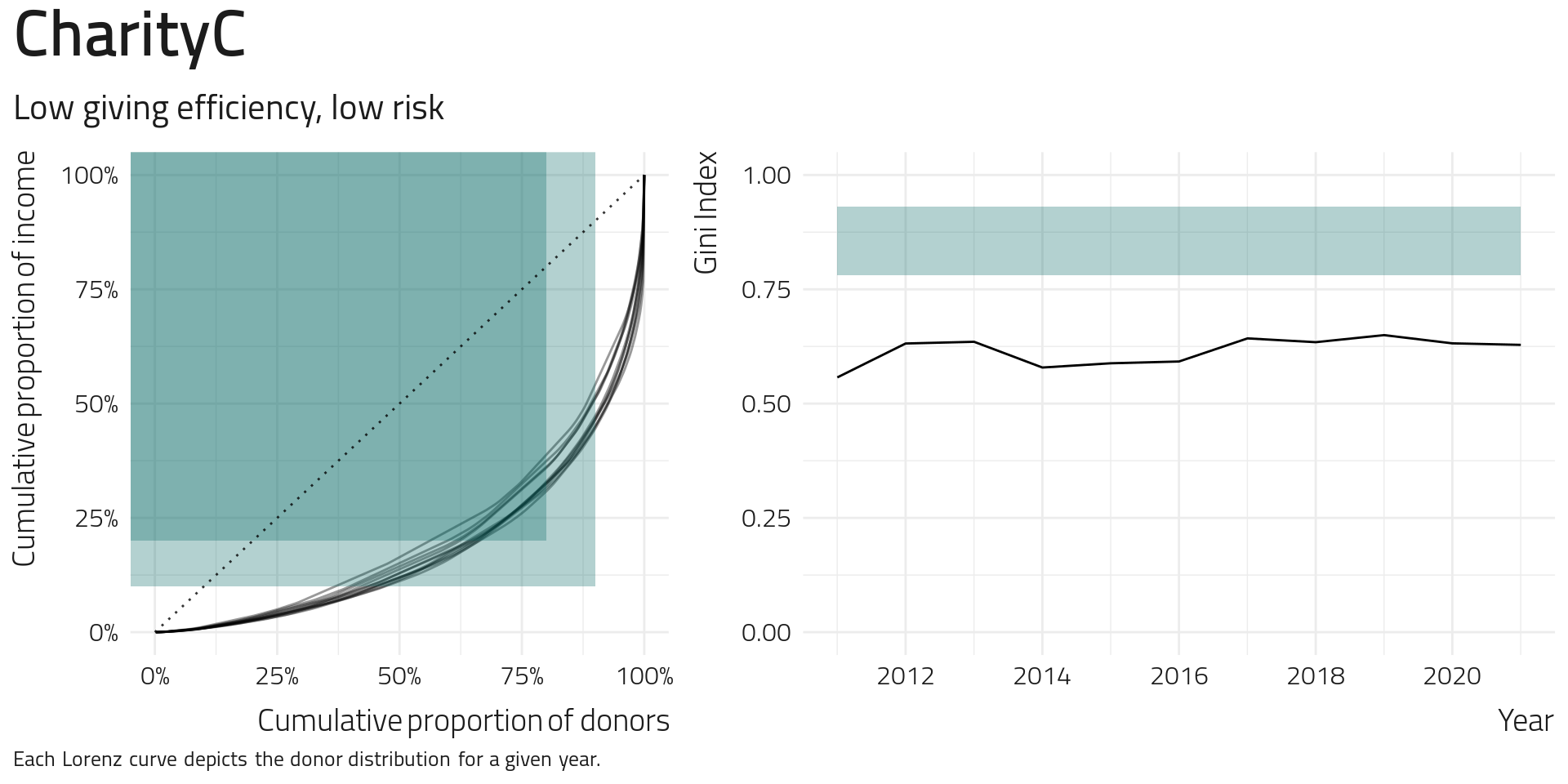
The above Lorenz curves were calculated from actual cash donation data from three charities for 2019. If a charities donors all gave equal gifts, we would see a straight diagonal line (no curve). As the line curves toward the bottom-right corner, it indicates that the income comprises greater levels of mixed gift value. To add context, we have also highlighted the 80-20 rule and a 90-10 rule. As we look at our three charities, we see some substantial variation in their Lorenz curves, with some having greater dependence on high-value donors than the 80-20 rule and some having much less. For one charity, the bottom 80% produce over 25% of the income, while for another, the bottom 80% produce less than 10% of the revenue.
So, what does this mean? When a charity’s curve gets closer to the bottom right corner, this means that more of the income is coming from a smaller proportion of donors. Another way of saying this is that the high-value givers make up a large proportion of the cash income. Conversely, when a charity’s curve is further away from the bottom-right corner and closer to the diagonal line, the donor contributions are more even. There is less reliance on high-value givers in the overall income. So, which is better?
In reality, both situations have their pros and cons. When a charity’s curve is shallow, the income is shared over the donors, so when a high-value donor leaves, this has only a limited effect on revenue. We can think of this as a conservative approach to risk, and this situation is less “efficient” as there may be high-value giving opportunities that are not utilised. When the curve is stronger, there is a greater reliance on high-value givers to deliver income, and so when such a donor leaves, this can have a significant effect on the bottom line.
We can get an idea of the impact by considering what happens when we remove the top 1% of donors from standard value (0-80th percentile), mid-value (81-90%), High-Value (91-95%), and the top 5% of donors.
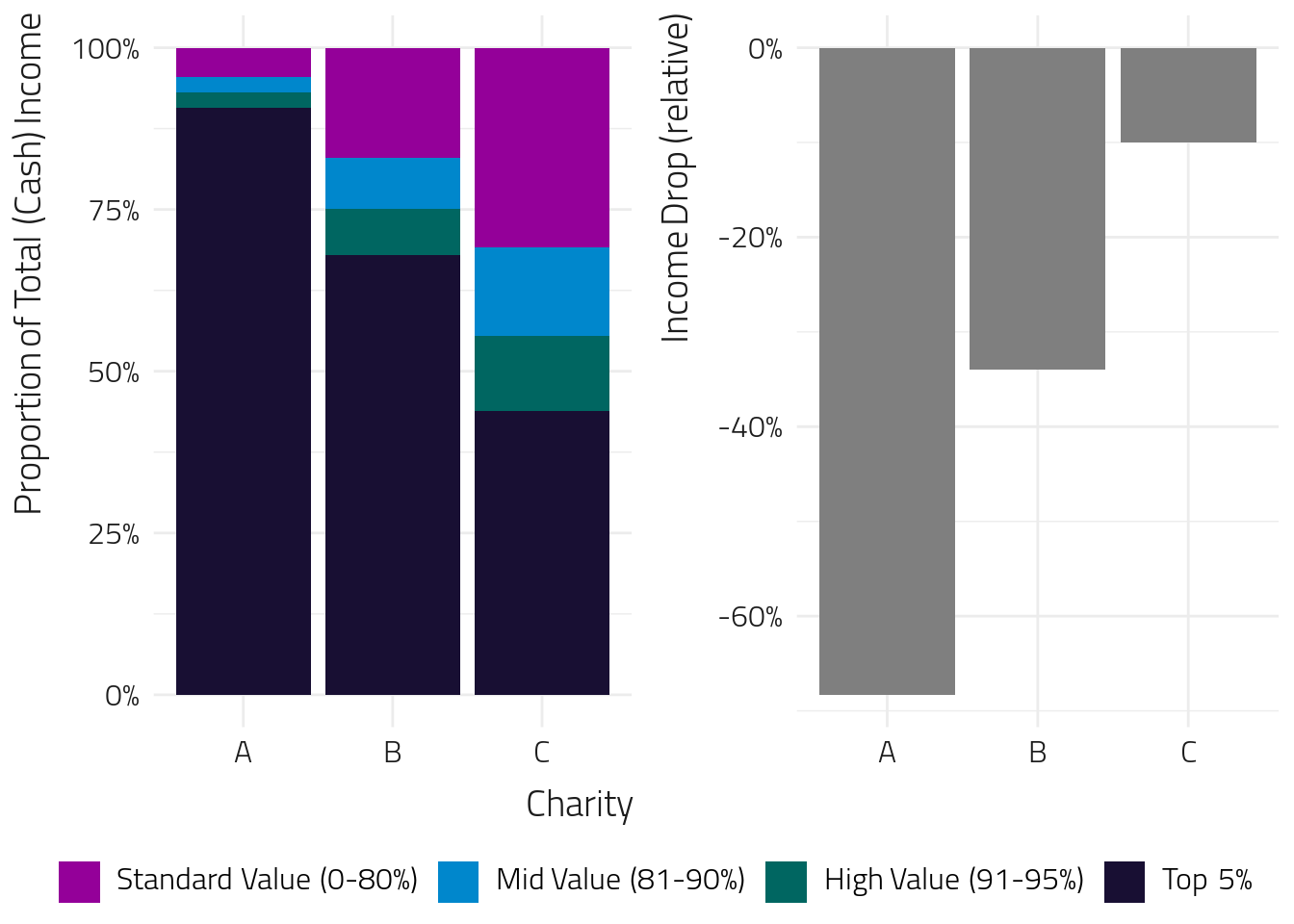
Wow! The reduction incomes are drastically different! There are a few reasons why a 1% drop in donors is unlikely to produce an outcome like the one depicted above. For example, high-value donors are less likely to stop donating since they are probably more committed, more frequent, and more long-term donors. We have also explicitly chosen the top 1% in each category, which can be considered a worst-case scenario for a 1% drop in donors. Nevertheless, it demonstrates how much additional risk a charity is taking if they shift to focus exclusively on high-value giving at the expense of standard and mid-value donors.
What is the “best” curve to have? We believe that it is important to achieve a middle ground; charities should ensure not to rely too much on high-value giving but also ensure they aren’t leaving high-value giving opportunities on the table for the sake of excessive stability. In other words, there is a trade-off between efficiency and risk. Some reasonable goal-posts aim for the Lorenz curve to pass below the 80-20 Pareto mark and above the 90-10 mark. Any shallower, we can be confident that there is unrealised high-value giving, and any steeper, there is potential for instability in income.
The Gini Index
One way of seeing how donor distribution changes over time is to consider the Gini Index. A calculation that converts the Lorenz curve into a single number. The Gini index is the area between the diagonal line (often called baseline) and the Lorenz curve, multiplied by 2. The result is that as the curve gets closer to the diagonal line, the Gini Index gets closer to 0, and as the curve gets further away, the Gini Index increases, with a maximum value of 1.
What Gini Index should we be aiming for? Gini indexes take a whole Lorenz curve and boil them down to a single value, so they aren’t hard and fast, but you can get a good indication of whether you are hitting the right balance just by looking at this one value. A Gini Index of 0.78 should correspond to a Lorenz curve which passes close to the 80-20 mark, while a Gini Index of 0.93 should correspond to a Lorenz curve which reflects the 90-10 mark, so we suggest that a Gini Index value between these two values indicates a good balance between efficiency and risk exposure.
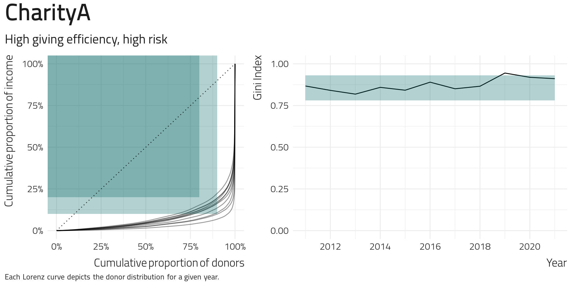
Looking at Charity A, we see that the Lorenz curves for the past ten years have moved around and are very often in the sweet spot between the 80-20 and 90-10 marks, but there is one year where the Gini Index goes outside the recommended range and another where it is very close. Looking at their Gini Index trend over time, we see an increased focus on high-value giving over the last ten years, although there has not been much variation in the previous three years.
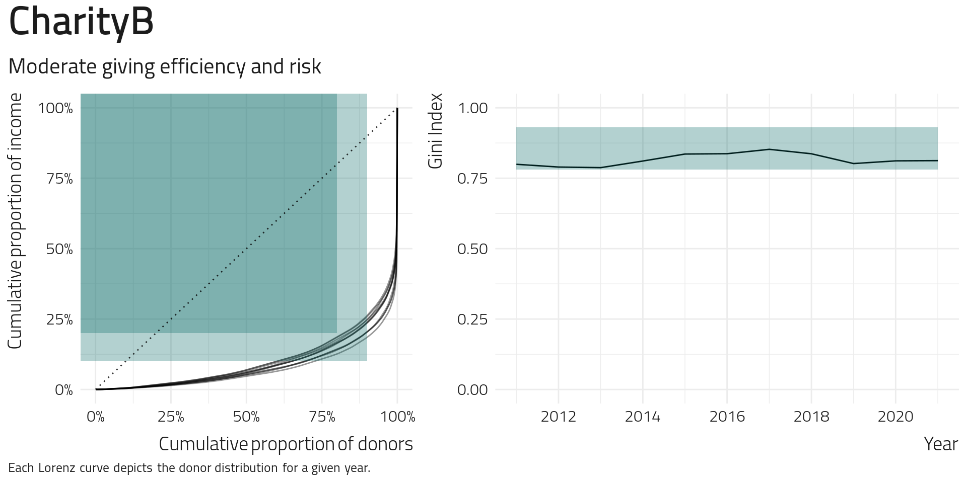
Looking to Charity B, we see much tighter Lorenz curves and less variation in the Gini Index over the years. This charity’s Gini Index seems to have increased partially between 2014 and 2018 from greater focus or reliance on high-value givers, but this reduced in 2019 and has been stable since.
Finally, Charity C has a reasonably stable set of Lorenz curves in the plot’s low efficiency, low-risk area. The Gini Index was high in the past (2012-13) and has seen a fall and subsequent increase since then. The growth has plateaued in the last year, indicating that high-value giving isn’t increasing relative to other donors.
What do I do with this number? The Gini index is a helpful diagnostic tool for determining whether you are getting the balance right between focussing on standard, mid, and high-value donors. If income is unstable, then a high Gini value (above 0.94) is a clear sign of high-value donor risk. If income is stable and the Gini index is low (less than 0.8), then there may be high-value giving opportunities to explore. The change in the Gini index over time can also indicate a drift toward more or less focus on high-value giving.
Some Caveats
When a highly generous donor gives a substantial donation (e.g. > $1,000,000, often called mega-donors), then a charity’s Lorenz curve will be very close to the bottom-right of the graph and the Gini Index increases substantially. There are two things to note here. First, the Lorenz curve only represents the instability in the current year and not an overall representation of the charity’s instability into the future. However, it does indicate that it wouldn’t generally be wise to count on such a performance of the high-value givers in subsequent years.
Another thing to consider is that Lorenz curves are contextual; the state of the charity and the type of the charity matter. While we’ve suggested that a charity aim to be between the 80-20 and 90-10 marks, there may be good strategic reasons why a charity does not lie within these points. For example, a charity with very high loyalty from the high-value givers (think Opera house) may have a steeper curve than the 90-10 mark and still have a stable income because the donors’ loyalty outweighs the risk from their small numbers. On the other end of the spectrum, an emerging charity may have a shallower curve than 80-20, simply because cultivating high-value donors takes time. Instead, these charities can aim to shift their curve in subsequent years as they invest in building high-value giving programs.
Additional areas of exploration
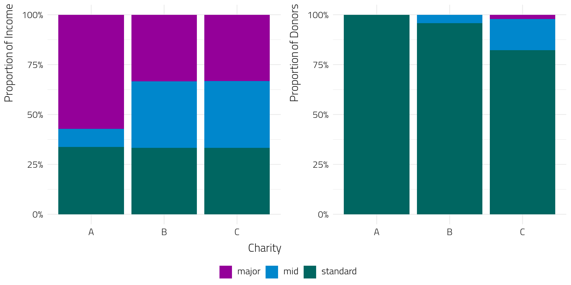
As part of Fundraising Insights, we’ll explore how we help charities define standard-value, mid-value, and high-value donors. By looking at the income distributions, we can separate the donors into groups such that the revenue from each group is balanced.
This helps balance out the risk.
We can also think of this as ensuring “fairness” between standard-value, mid-value, and high-value programs since each contributes more evenly to the overall income. The chart below shows that charity A can’t share revenue evenly across the different value cohorts due to one exceptionally generous gift. However, our other two charities allow us to see an even balance of income in the left-hand chart. The right-hand graph shows the complementary view of donor proportions to achieve a balanced revenue split between standard-value, mid-value and high-value donors.
In assessing revenue contributions in this manner, we’re able to help charities define giving thresholds for higher-value donors so they can better focus their attention and strike a healthy balance between risk and efficiency.
If you’re interested in understanding how well your charity balances risk and efficiency or need richer information to develop your high-value giving strategy, register to participate in our 2022 program today.
